Choosing the right colors and shapes is an essential part to reaching the right audience with the right emotions as a graphic designer. People often feel certain emotions when seeing certain shapes and colors and as a designer you will need to be able to use them correctly.
Here is a quick breakdown of how colors are used in different logos:
- Red: Creates excitement, hunger and increases heart rate. It represents
 l
l ove, passion, and danger. Red is used by many food companies and news outlets.
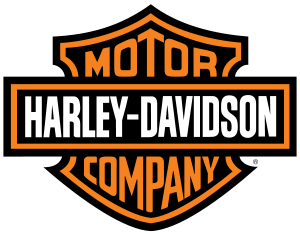
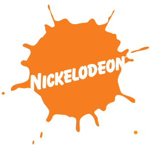 Orange: Stimulates creativity and energy. It is used for both alerting to danger and to show cheerfulness. Orange often creates a call to action. It is used by companies that want to convey youthfulness and fun. Used in everything from clothing companies to tv networks.
 Yellow: Signifies positivity, happiness and optimism. It can show friendliness and caution. Often used by food companies and transportation logos.
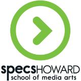
 Green: Displays peacefulness and health. It can create a calm environment and signify wealth. Often it will alleviate depression and symbolize nature. Green is used by food companies wishing to show health options, outdoor based products and by us here at Specs Howard School of Media Arts!
- Blue: Often used to display peace, security, and trustworthiness. Many cultures use blue to show masculinity. It is associated with water and increases productivity. Used by many social media and technology based companies.

 Purple: Was often used by royal families to signify power and wealth. It is used to calm and uplift and display creativity. Used to sell beauty products, food, and technology.
Shapes are also used with a purpose. Here is some reasoning behind the use of certain shapes in advertising and logos:

![]()
![]()
- Circles: Creates a feeling of positivity, friendship and unity. They are graceful and often used to show femininity. Used by transportation and food companies and often with sports teams.
- Squares: Depict stability and trust. Often seen as boring and uninviting. They can show professionalism and security. Used by financial services, and some tech based companies.
- Triangles: Often show power and masculinity. They are used for science, religion and law. Triangles can suggest action and direction. Are often used by travel, technology, and financial institutions.
Interested in learning more about the construction and layout needed to create awesome logos like these? Want to learn more about the Graphic Design industry? Click on our logo below to learn more about the Graphic Design Program here at Specs.

If you are interested in learning more any of the images you have seen above, click right on the picture to take you to their site!