By Dylan Mierzwinski The term skeuomorphic is enough to make anyone conjure up images of mad scientists and experiments gone wrong, but really its just a term for the main trend that was going on in web and user interface design in 2012. Although web design doesnt wait for December 31st of each year to evolve, we do notice major trends and changes from year to year. This post will be all about the major shift designers have seen: From skeuomorphic to flat design.
What is skeumorphic design?
Wikipedia defines skeuomorphic as: a derivative object which retains ornamental design cues. This is translated into the design world as user interfaces that look how they do in real life. Design elements that have shadows, gradients, reliefs, usability, and details that resemble how that object would look and act in the real world. The one that should stick out the most to us is Apples use of skeuomorphic design. From their calendars to their tool bars, materials and details are very much derived from real world materials associated with each digital element.

The same is true with Apples iBooks. It doesnt take much to realize that youre looking at a literal bookshelf. Shadows, wood grain, sanding and all.

Apple isnt the only user of skeuomorphic design, though. Tons of websites utilize skeuomorphic elements. Things like stitching, sticky notes, badges, and buttons are all included under the umbrella of skeuomorphism.

bluebell.com
You may be so used to seeing this type of design used that it seems obvious to point it out, but the fact is that it IS a trend that dominated in 2012 (a few years before, as well). Skeuomorphism is seen substantially in apps and software, too.


PROS & CONS
|
|
Which brings us to....drumroll please....flat design! (Wait havent we seen this before?)
Yes, yes we have. Flat design is nothing new. Just like denim vests and metal studs, if you put it in the closet for enough time, someone will bring it back out and think its the best thing there ever was. Flat design, to keep it simple, is minimalistic design whose biggest detail is color. SOMETIMES youll see the subtlest of gradients. This sounds boring and like it doesnt take much work, but flat design is a breath of fresh air among all the component heavy skeuomorphic websites with interactive piggy banks and pilot-tier control panels. What may look simple makes room for lean and mean interactivity and usability. The reason its easy to take flat design for granted is because its so easy to use. Think about a pitcher, the shape is simple and intuitive, but without the very simple spout, your liquid would go everywhere. That was an awful metaphor, but hopefully you get the picture. Flat design looks simple, but thats because it is simple for the user. Flat design can be the result of a well-oiled-machine behind the scenes. Enough talk, here are some examples.

oak.is
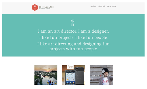
bobgalmarini.com
Just like skeuomorphic design, flat design doesnt just lend itself to websites. Applications and user interfaces benefit greatly from a haircut and some flat design. Think about the latest operating system from Windows, Windows 8. The entire interface is modular and simple. The following are examples of various flat designs. 
flaticons.co


PROS & CONS
|
|
|
|
|
So there you have it. The big change in web design style trends isnt really anything new at all, but such is life.
Dylan Mierzwinski is a Specs grad who has had the opportunity to dabble in all that the digital media world has to offer. Starting out as an editor, Dylan found her love for the web through admiring different videographer's websites. Wanting to have a hand in everything creative, she decided to take on web design. They've been together ever since. You can see more of her work at Dmierz.com