By Dylan Mierzwinski These days we have loads of different devices: laptops, computers, iPhones, iPads, Nexus tablets, Smart TVs, Android phones, Kindles, Nooks, Netbooks, (Google glasses?) and so on and so forth. What do all of these devices have in common? They connect to the internet. With the myriad of screen sizes, resolutions, browsers, and need for information comes the need for responsive web design.
What is Responsive Web Design?
Responsive web design refers to a websites capability to be able to respond to the way in which the user is accessing the information. For example, if you're looking at a website on your phone, you're probably looking for a specific experience; maybe that means tapping a collection of numbers and having your phone recognize it as a phone number. Or swiping through picture galleries instead of clicking through. Maybe that means having a stores hours and contact information in an easy-to-find location. These are just some examples of the considerations that need to be made when making a successful responsive website. Below are pictures of the same website (www.johannlucchini.com) on different devices. Notice how the content never changes, but the layout, functionality, and feel of the site absolutely does.

Notice how the number of photo columns changes from device to device to accommodate screen size. I'm an art director... isn't even part of the design on the mobile layout. These layout changes are so intuitive that as a web user you probably don't even notice it, but this is the world web designers live in now. Constantly answering the questions "How will people be accessing this information?" and "How can I make the experience more positive for every user?".
How does Responsive Web Design work?
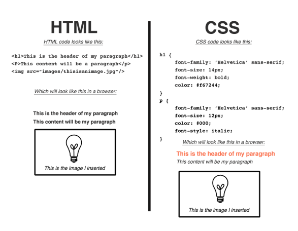
To understand how responsive sites work, you have to have a basic understanding of how websites work in general. Responsive web builds off of two basic languages: HTML and CSS. You can think of HTML as the structure, answering the questions what IS everything? It's the language that builds the house of your website. It says this is the foundation, this is the window, and this is a door, or as it pertains to websites this content is a paragraph, this content is a header, and this content is a picture. CSS then comes in as the architect and designer, answering the question how should everything look? It says this image should be on the left side of the site, this text should be bold and orange, and this paragraph should have small, italicized font. Below is a more in depth look at this concept, but really the only thing you need to know is that HTML is the structure and CSS is the style.

Back to the main question, how does responsive web design work?, it uses what's called a Media Query. A simple piece of script that (and here's the key) fetches different CSS styles contingent on the type of device you're on. This allows web designers to specify how the page will look based on things like device screen size, orientation (is your iPad in portrait or landscape mode?), etc. Thats it! It sounds very simple but it's an advancement in web design that has made an extremely powerful impact. For web designers it means being better at our job and being able to cater to the most important person, you, the user. For instance, CSS styles for people who are visiting a site on a mobile phone may say Okay, if you're looking at this site on a device that has a screen size less that 480 pixels (which would be a mobile device) and has a landscape orientation (having the phone on its side, instead of upright) then apply these specific styles. Those styles will then adjust layout, font sizes, menus, really anything that needs to change for your experience to be better! For those of you who are really interested, this is what a media query might look like:
@media only screen
and (max-device-width : 480px)
and (orientation : landscape) {
/* Styles */}
Some Pros and Cons
|
Pros |
Cons |
|
|
Really, the bottom line is that responsive design is a result of the way people communicate and retrieve information today. It may be more work, but if designers cannot or are unwilling to meet the needs of their users then they will potentially fall behind. Responsive web design not only responds to the device it's being viewed on, but it's a response to the type of culture we have and the needs of web users. It's an incredibly powerful tool. For further experimentation feel free to visit your favorite sites and resize your browser; what happens when you make the browser really small? What does it look like when you visit the site on your tablet?
For further reading and specifications please visit the following sites:
http://johnpolacek.github.io/scrolldeck.js/decks/responsive/
http://www.w3.org/standards/webdesign/htmlcss
Are you interested in learning more about web design? Check out our Graphic Design (GFX) program here at Specs Howard School of Media Arts. Not only do students in the GFX program learn how to design, create, host and maintain a website, they also learn how to build a cohesive brand for companies, create vector artwork by designing layers, and format and create print-ready pieces with appropriate images and typography. Don't wait until it's too late, speak with an Admissions Representative today by calling 866-61-SPECS, by clicking here or click the button below.
Dylan Mierzwinski is a Specs grad who has had the opportunity to dabble in all that the  digital media world has to offer. Starting out as an editor, Dylan found her love for the web through admiring different videographer's websites. Wanting to have a hand in everything creative, she decided to take on web design. They've been together ever since. You can see more of her work at Dmierz.com
